Neon tubes on paper - advertising (almost) without words

02/19/2024

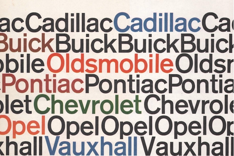
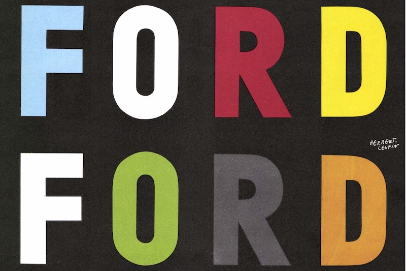
Almost a year and a half ago, we presented a wonderful advertisement by General Motors Suissein the typical, minimalist Swiss typography style. Now, of course, we don't want to give the impression of bias or one-sided reporting. That's why we're now adding a very similar piece from Ford. The opponent from Dearborn even refrained from mentioning the individual Group brands or even any other words apart from the name in its advertisement. Instead, the lettering, repeated four times in different colors, almost looks like a flashing neon sign printed on paper.
Share this article with your friends!