When lettering was still allowed to be illegible
08/23/2022
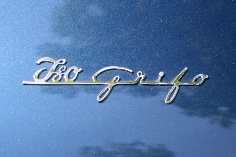
What, please, is a "J80 Corilo"? Anyone who played with the dark blue Matchbox model number 14 as a child will certainly know what the big sports coupé is actually called, because Lesney was clever enough to emboss the name in large block letters on the base plate and thus into the long-term memory of countless young car fans. Everyone else sometimes has to look twice to decipher "Iso Grifo" on the trunk lid.
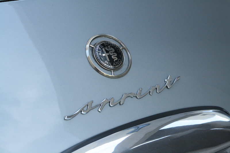
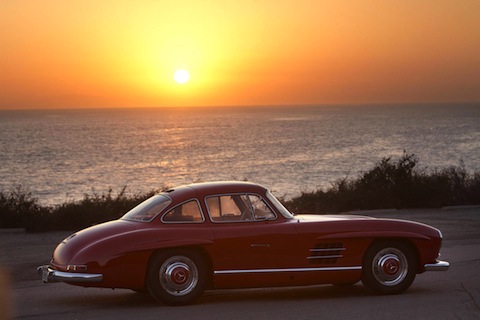
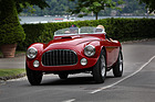
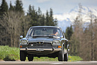
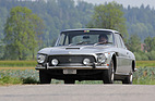
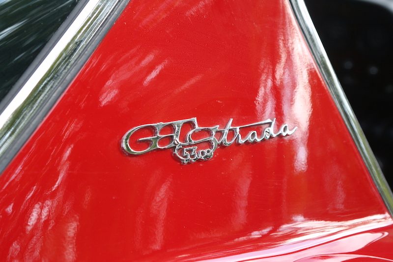
When nobody was talking about "brand awareness", the lettering on a car could only be recognized at second glance. It was much more important that the style of the lettering matched that of the car: straightforward and elegant on the Pontiac Silver Streak, youthful and lively on the Alfa Romeo Giulietta Sprint or passionate and wild on the Bizzarrini GT 5300 Strada.
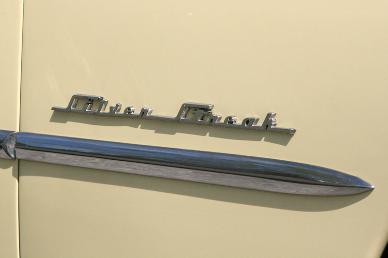
However, legibility was sometimes a problem, as the individual letters tended to merge with one another or, in their curved recklessness, morphed into another. The owners generally didn't care that passers-by mistook their car for a "Siljen Gneah", an "Inrint" or an "OHS 53m tiada". After all, they knew what they had bought.

_RM.jpg)