When real colors were still in the majority
02/05/2025
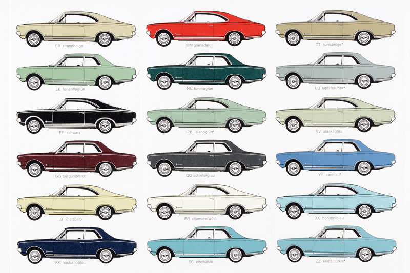
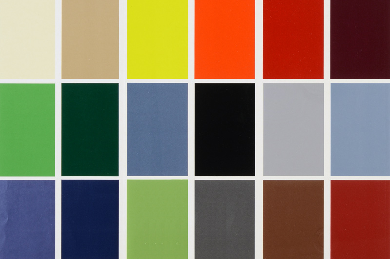
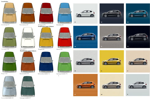
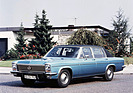
Grana red, teneriffa green, noble turquoise, nocturne blue, corn yellow, burgundy red, tunis beige or horizon blue - the color palette of the Opel Commodore in 1967 not only sounded colorful, it was colorful. Although there was a lack of super-bright colors apart from "grana red", the various shades of blue and green were fun.
They could also be combined with a vinyl roof and a beige, blue, red, black or gray interior in fabric or (breathable) imitation leather.
Of course, there were also a few shades of grey and black and "chamonix white" were not missing, but overall the "right" colors predominated, which according to the "Colors & Upholstery " brochure were also carefully branded. A third of the colors were metallic.
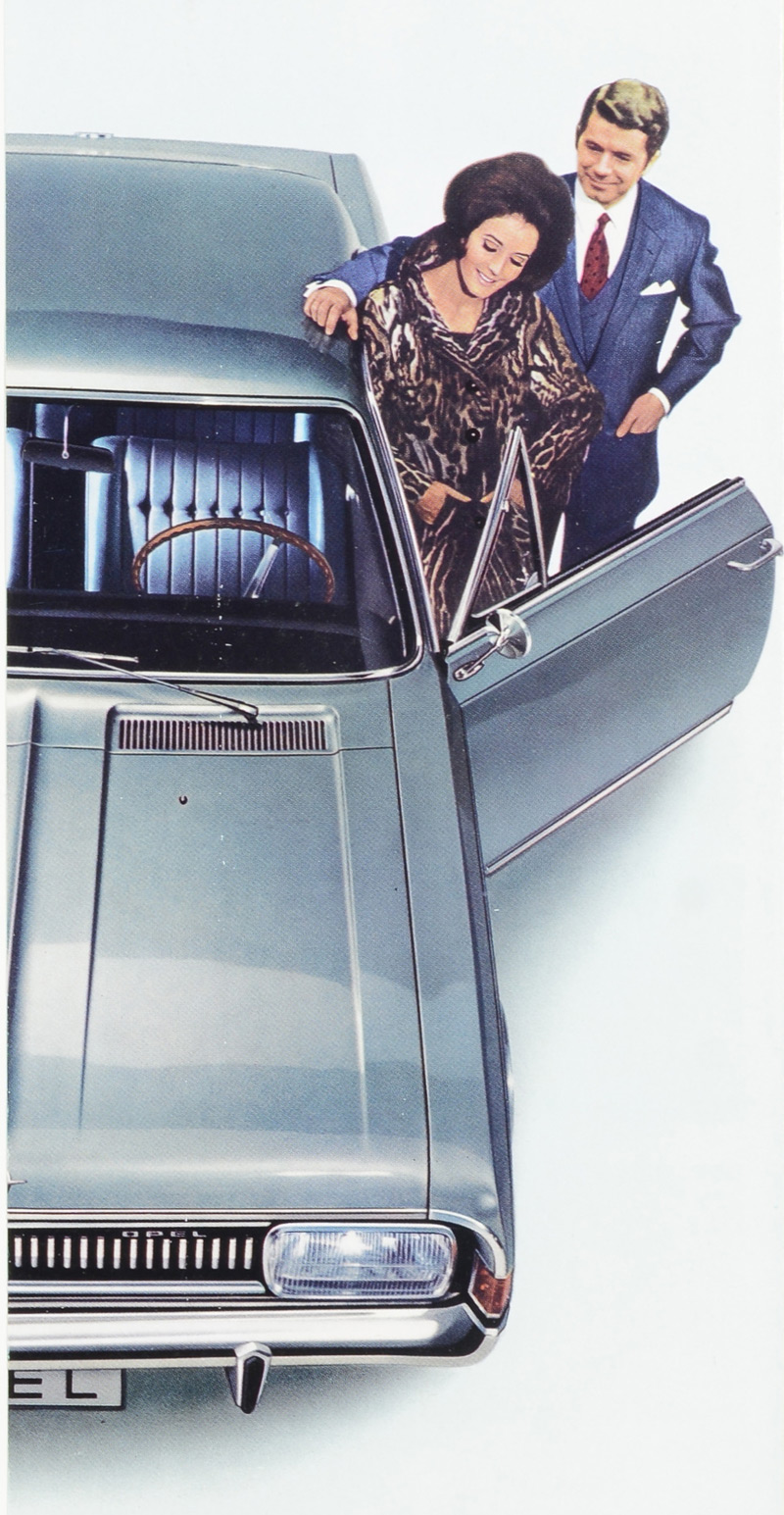
Yes, it was a different time, but the people in charge at Opel obviously still thought that their customers would prefer to have a "laplata silver" Commodore, at least that's how the car is shown on the back.