


The beginnings of Porsche with the 356/1 and the Coupés from Gmünd, Beutler from Thun and the 356 production in Stuttgart at the end of the 1940s are well known and described in detail.
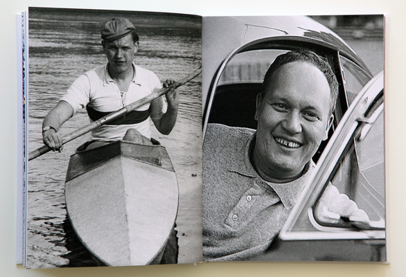
But how did the Porsche image actually come about? Mats Kubiak's book about Erich Strenger explores this question: Strenger, born in 1922, was an author, photographer, designer and illustrator and, with these skills, one of the people who had a decisive influence on Porsche's image in the early 1950s and 1960s.
A man with many qualities
This monographic and monothematic book on Erich Strenger is the first to present a comprehensive collection of his works created in connection with the Porsche company between 1951 and 1988.

Without claiming to be exhaustive, the highlights of his work are highlighted in order to emphasize the designer's approach and methods. His work had a lasting impact on the company's corporate design at a time when nobody was even using the word.
Erich Strenger and Porsche
By chance, Strenger met his seatmate Richard von Frankenberg, a well-known German automotive journalist of the time, at an event in Stuttgart in 1950, who was building up the marketing department at Porsche as a one-man company. From then on, the congenial duo worked on raising the profile of the Porsche brand. Von Frankenberg was responsible for marketing, Strenger for public relations.

Until 1988, Strenger's work revolved around the Stuttgart-based sports car manufacturer. He was never permanently employed, but initially worked as a freelancer, later founding an advertising agency that mainly worked for Porsche until the end of the 1980s.
About the content of the book
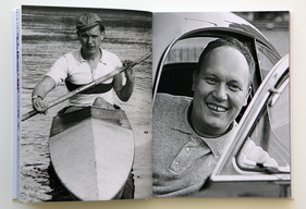
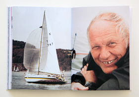
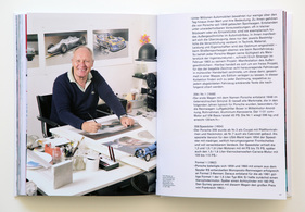
The author Mats Kubiak calls his book a graphic report in the subtitle. And indeed, the almost 200 pages contain countless graphic works in the form of covers, brochures, posters, racing posters, illustrations and much more. In between, he intersperses short but concise text passages about both Strenger's life and his working methods. The sheer wealth of material is impressive, but this book can only present an excerpt of his life's work. But one can imagine the creative power that must have been behind it.
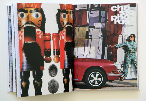
Strenger was not only co-initiator of the customer magazine "Christophorus", one of the first customer magazines published by a car manufacturer. No, Strenger also developed the Porsche lettering that is still in use today and the corporate color HKS17. This Bordeaux red was not a Strenger development, but was due to Porsche's tight advertising budget. Strenger had discovered the remaining stock of the color at a print shop, bought up all the supplies and then had Porsche's entire business stationery printed in it. From the envelope to the stationery to the operating manuals, Porsche had a striking corporate color that is still part of the corporate design today.
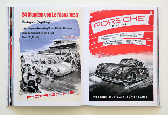
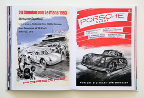
Whether illustration, photography or layout. Strenger was the man for everything. Countless well-known racing posters, from the first Le Mans class victory in 1953 to endurance racing successes in the 1980s, bear Strenger's signature and were absolute classics in their day.
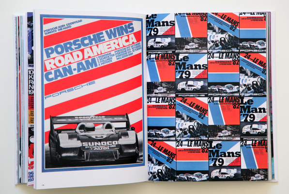
When leafing through the pages, one is repeatedly surprised by the richness of the design and the artistic, graphic interpretation of the realizations. Especially when, for example, several posters or covers are shown side by side on one page for comparison.
The collaboration with Porsche ended abruptly in 1988 with the Götz von Berlichingen quote. Strenger, who of course also designed the Porsche calendars for many years, met a new team at Porsche in 1987/88, who were extremely critical of the designs he presented. When the lamentation would not end, Strenger ended the meeting with the four words (fuck you), which ruled out any further collaboration.
The Strenger-Porsche story
Little text, lots of pictures. A good combination. Only in this way can the impression of this book, published in the "Edition Porsche Museum" series, unfold its full effect. The author succeeds in stringently unfolding the life's work of a man for the Porsche brand who was not known in this way. The fact that Kubiak does not omit Streicher's freelance work and also sketches his private life ultimately provides a very good impression of the parallel development of a person and a company.

Perhaps the book would have been better served if it had been published in the concise "brick format" of the Edition Porsche Museum. The so-called lexicon octavo format used here is compact, but limits the design options somewhat. Nevertheless, the book is an absolute eye-catcher in terms of design and typography, despite the somewhat low-contrast printing and matt paper.
Despite the rather short amount of text, the book succeeds in getting closer to the person and work of Strenger and thus provides a picture not only of Porsche but also of Strenger.
Bibliographical information
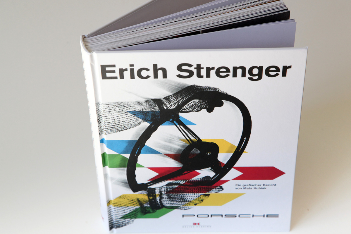
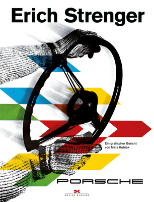
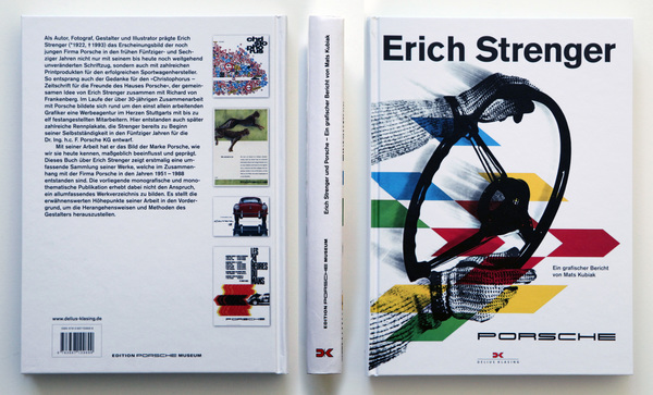
- Title: Erich Strenger and Porsche - A graphic report
- Author: Mats Kubiak
- Language: German (or English)
- Publisher: Delius Klasing, 1st edition 2017
- Format: Hardcover, 192 x 256 mm
- Scope: 186 pages, 195 color pictures
- ISBN: 978-3-667-10969-9
- Price: € 39.90
- Reading sample: On the Delius publishing site
- Buy/order: Online at amazon.de, online at Delius-Klasing Verlag or in a well-assorted bookstore